
Spring Flowers: Community Wisdom
I asked the Learn to Paint Podcast community to share their favorite-to-paint flowers. Take a look at all the beautiful work and wisdom they shared. (And thank you, artists!)
Amy Rabon- Gladioli
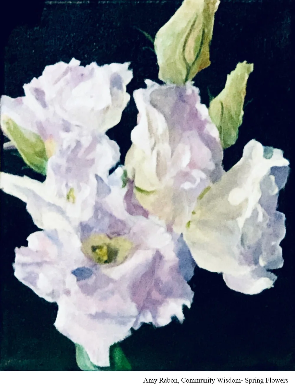
Painting: “Glad Tidings”
Medium: Acrylics on canvas
Instagram: @arabonart
Website: www.AmyRabonArt.com
I love gladioli because they have a strong structure and at the same time, flowing petals. Painting them is like painting chaos! Each flower is different and the petals flow into each other. To paint them you have to paint exactly what you see, not what you think you see. It’s a challenge, but a worthy one on the road to being a better artist.
Andrea Gant- Peonies
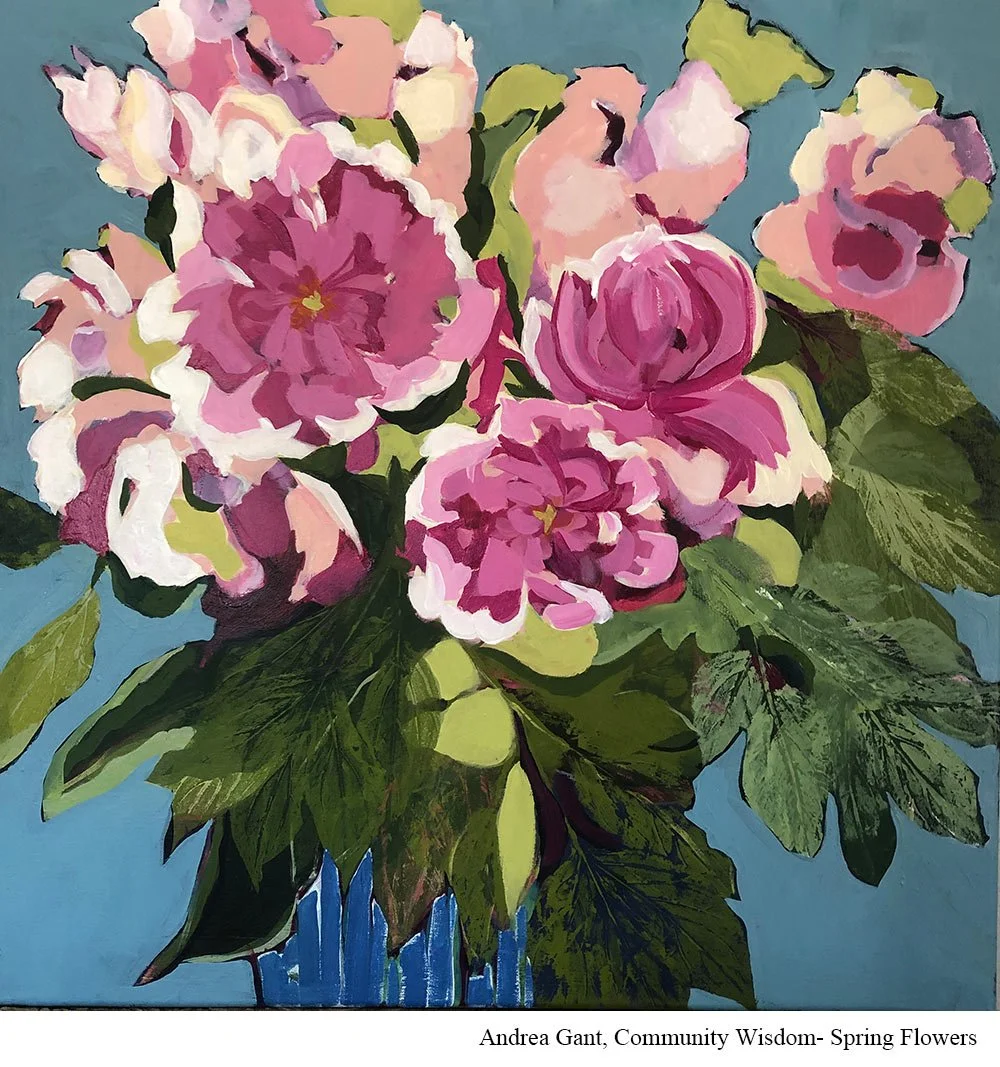
Medium: Acrylic
I love to paint peonies because of the large and feathery blooms. The color range can be so many shades of pink.
Finding the leaves challenging, I rolled paint on stems and leaves and created prints as part of this still life. This painting I've returned to again this spring and keep layering. (Still in progress!)
You can paint the tight closed petals all the way through the open blooms when they become so heavy they fall over.
Bonnie Ryan- Lilacs
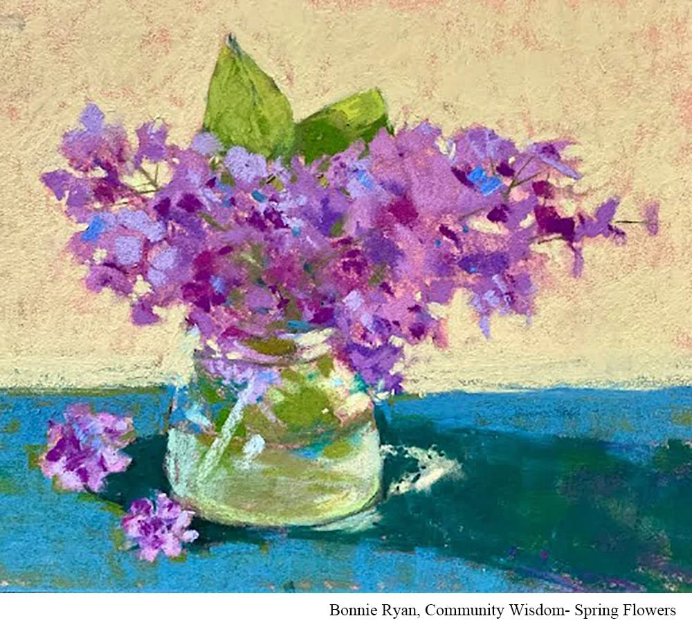
Medium: soft pastel
Instagram: @bonohbon
This is certainly a favorite spring flower. I have many! There is a lilac tree in my backyard, so being able to go out my back door and find inspiration is a lovely thing. The tricky part is that speed is of the essence. Lilacs don't last long indoors or out. If I want to paint from life I have to move quickly. The advice I try to follow (and not just for flowers or painting)...start with the big shapes/ideas.
Brent Kimber- Poppies
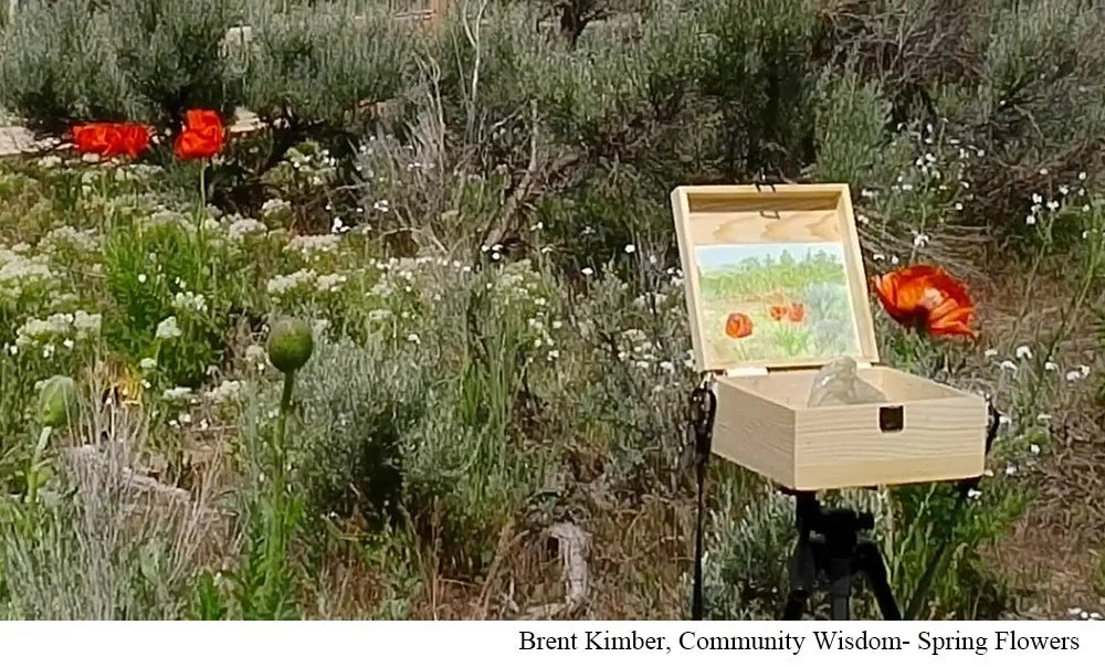
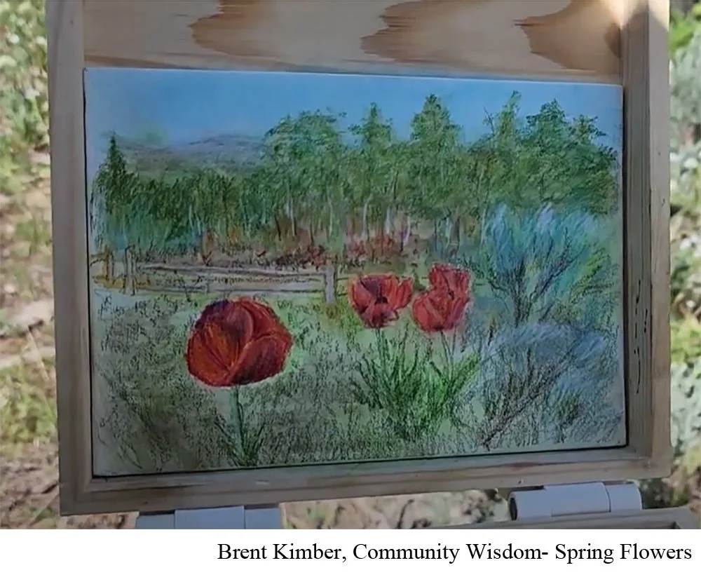
Painting: “Homestead Poppies”
Medium: Watercolor Pencils on Canvas Panel
Instagram: @paintwithpencil
YouTube: @paintwithpencil
I love painting these poppies because there is an old historic homestead/park near me where they spring up like wildflowers in an otherwise high-desert landscape full of dry land and sagebrush. They only bloom for a couple of weeks so it is sort of a rare treat to see them each year. This patch is truly wild, so depending on the winter water, there may or may not be very many. I recorded my experience of painting these in this YouTube video.
The tricky thing about painting red flowers is that it is often best to try to do it in person and not from a photograph. Most cameras don't render subtle shifts in red colors very well. So seeing them in person is ideal.
My only advice for painting them is to just give it a try and don't worry too much about getting it perfect. Just enjoy the process.
Diana Bennett- Poppies
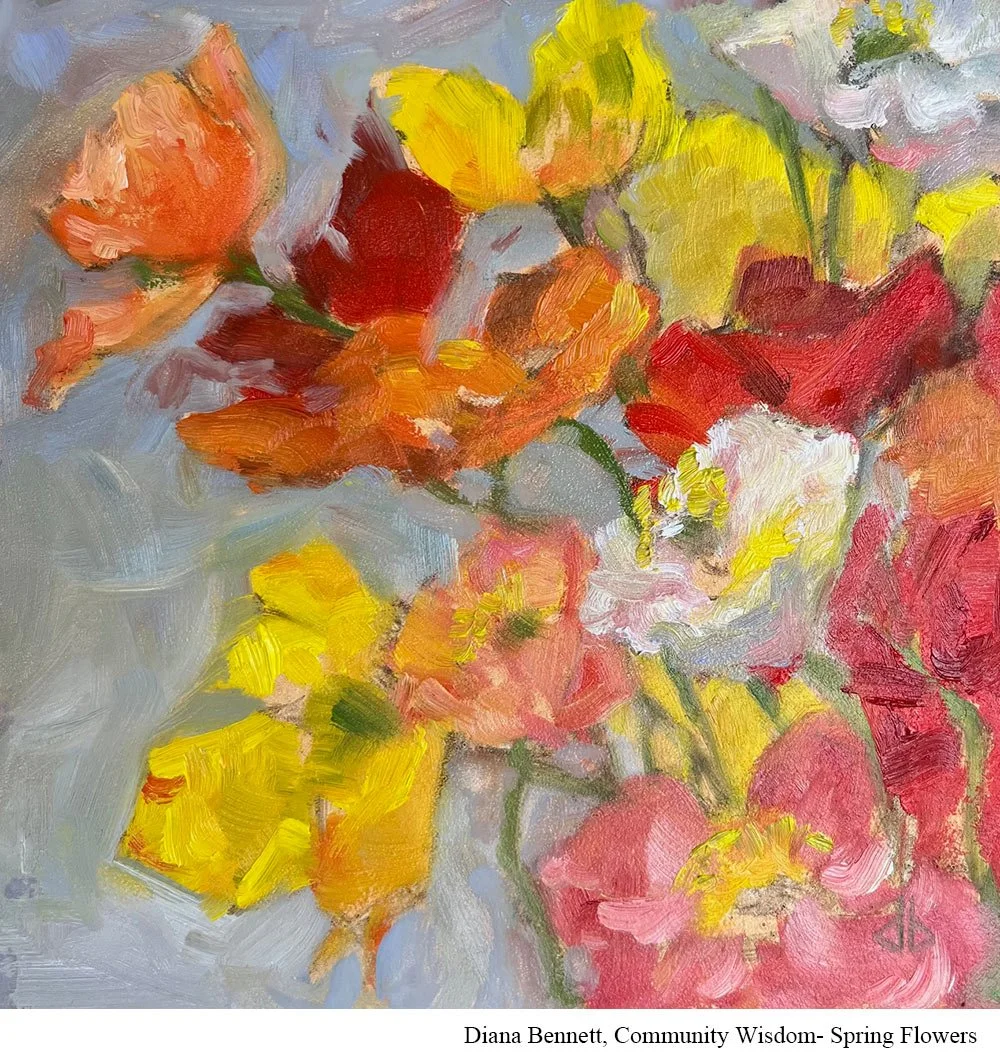
Painting: “Iceland Poppies”
Medium: Oil on panel, 6x6
I loved painting these particular flowers because a lovely neighbor, Jane, gave this bouquet of Iceland poppies, which she had grown in her garden, to my mother and I. Jane is a loving, considerate woman with a sensitive heart and a similar background of deep loss and grief to my own. I cherished this gift of flowers and wanted to capture their ephemeral beauty, a metaphor of the poignancy of each of life’s moments whether joyful or sorrowful or even simply mundane.
It’s tricky to capture the delicacy of flowers. My intention wasn’t a photorealistic portrayal, but rather an attempt to describe their joyful exuberance.
Advice for painting this (or any) flower - focus on shape and edges, and the delicacy of color shifts within the petals.
Donna Thibodeau- Hellebore
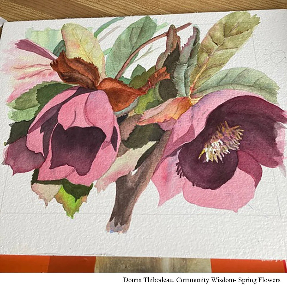
Medium: Watercolor
I love this flower because it is the first spring flower in Michigan.
Getting the values dark enough in the dark areas is tricky. That is the drama.
It can get busy with all of the leaves and shadows so you have to keep that all straight in your head.
Joanne George- Mixed Floral
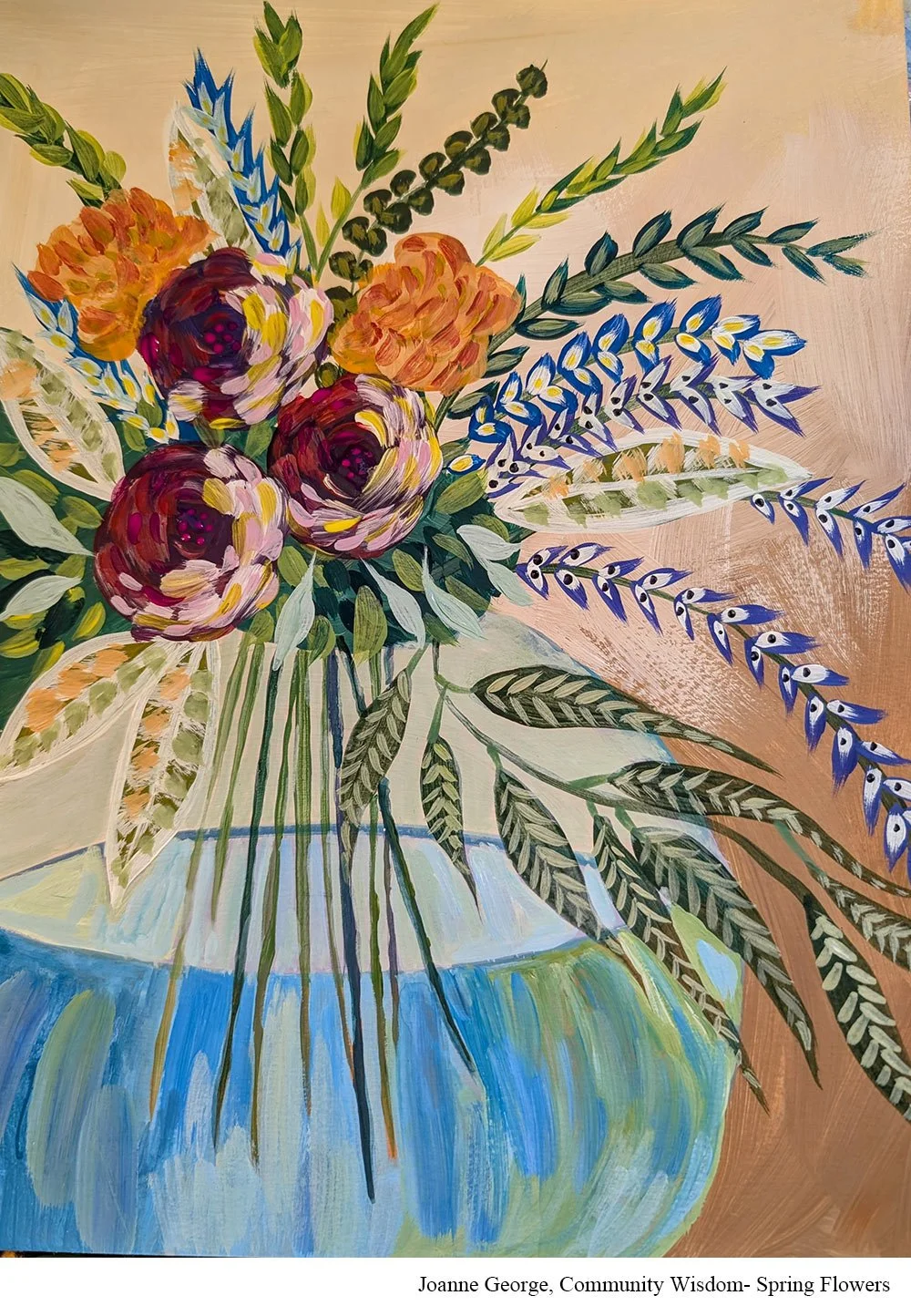
Medium: Acrylic
Instagram: @joanne_george_art
This acrylic mixed floral painting was inspired by The Art Sherpa. The negative painting part was a bit challenging, but I was quite pleased with the finished painting. I had fun filling in all the leaves and details.
Jude Gwynne- Lilies
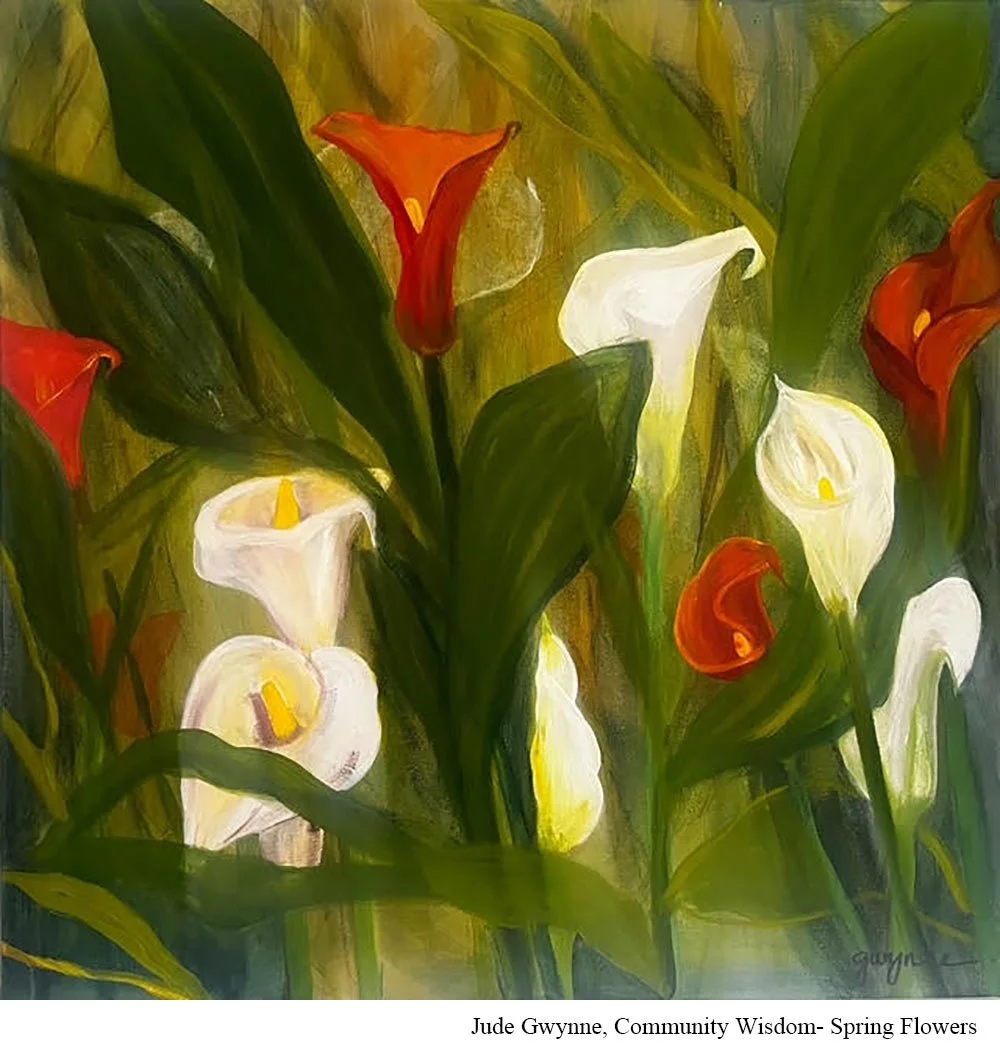
Instagram: @jude.sart
I love painting lots of flowers but I spent more time this spring on lilies. I love their shape, it is voluptuous. Getting the basic triangle in place first helped a lot.
Katherine Abdun-Nur- Daffodils
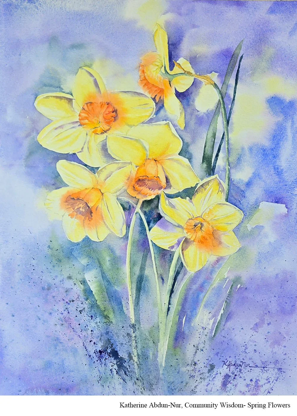
Painting: “Joy Bringers”
Medium: Watercolor
Website: katherineabdun-nur.com
Instagram: @katherineabdunnurwatercolor
Daffodils! They are challenging due to the limited variations in the color yellow. If I do it again, I'll merge and soften more of the flowers, focusing only on one or two.
Kathleen Conover- Poppies
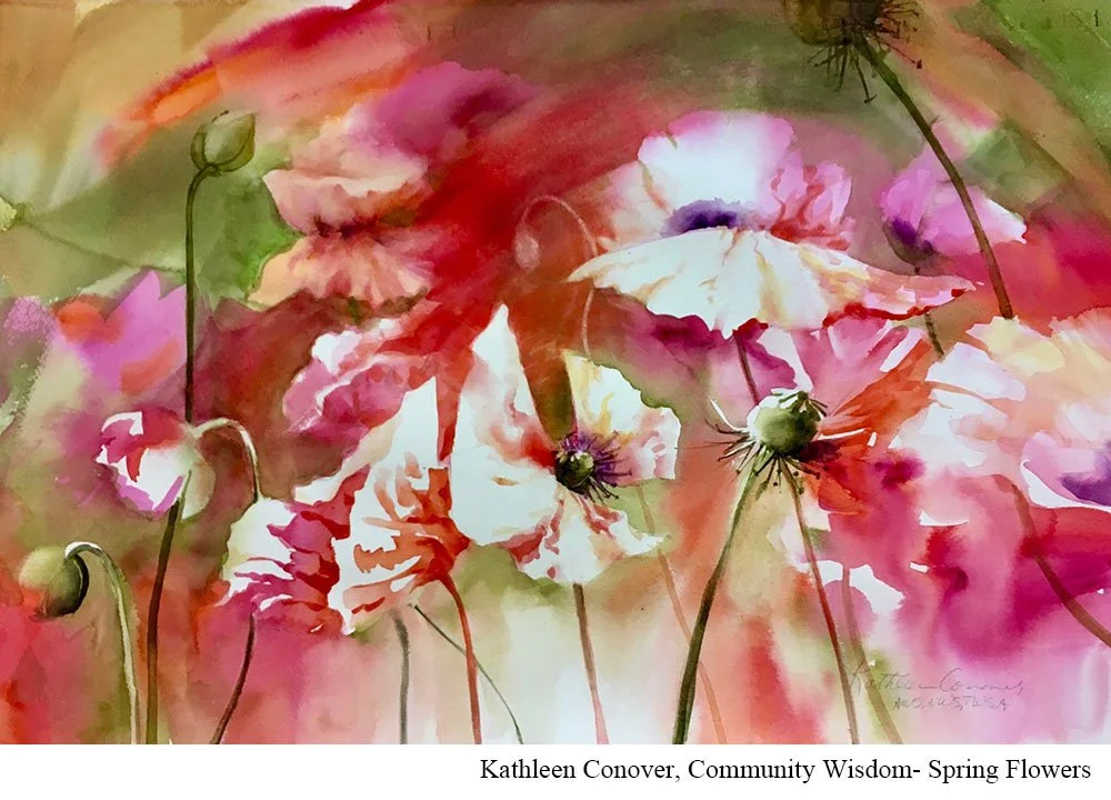
Painting: “Poppy Jubilee”
Medium: Transparent watercolor on 140# watercolor paper, 22x 30”
Instagram: @conover_watermedia
Website: https://kathleenconover.com
I’m sharing my favorite flower(s), the Poppy. Here, the simplest of many varieties, Icelandic Poppies.
The poppy flower represents “spring” to me. They are such a fragile and happy flower that emerges strong each spring after very harsh winters in my Lake Superior region. I must be ready to paint when they pop up out of the earth because they are also very short-lived.
A challenge with the poppy is that it doesn't like being cut and brought into the house. They also can't be purchased in a flower shop. So, I can only paint and photograph them in their short window of blooming time.
Most of all, is the encouragement to approach these lively and colorful flowers with an attitude of Fun! That said, I quickly draw a few main blossoms, wet my paper around those flowers, and let a mix of colors flow in the negative space around the white areas, mixing with each other, wet-in-wet. I let all that dry thoroughly. Next, I’ll develop those most important poppies in the white areas. Finally, I can think about balance and composition, adding darks and lifting lights where needed. Although the first wash goes quickly, there is always a high “fuss-factor” at the end.
Maggie Bogdan- Daffodils
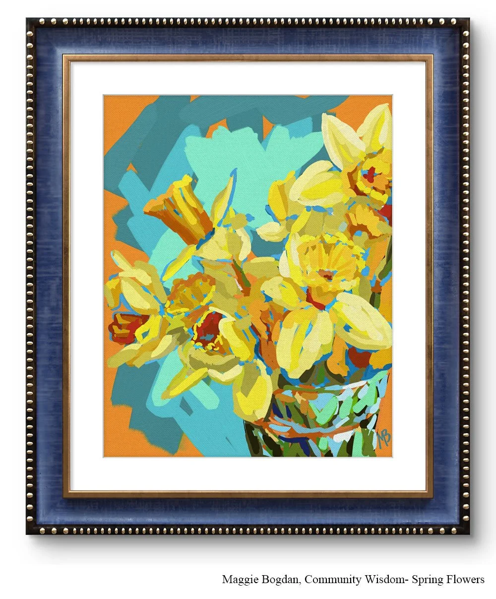
Painting: "Signals of Spring"
Medium: Digital Painting
Instagram: @maggie_bogdan_studio
Daffodils are so intriguing to paint because of their depth and many shapes. They have more shades of yellow than you would think possible all in one flower! The depth of the corona, or funnel-shaped part of the daffodil is what I find the trickiest. It's challenging to paint the shape in a way where it comes forward toward the viewer. I think value comes into play here to help make this flower look three dimensional on paper.
Natalia Adamson- Peonies
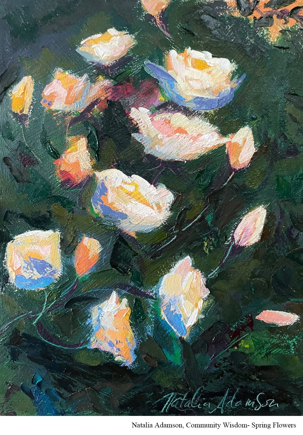
Painting: Ethereal Garden
Medium: Cold wax and oil on panel
Instagram: @nataliaadamson.art
Website: nataliaadamson.com
Peonies are my favourite!
I love the colour gradations and hints on light passing through the petals. They take some time to grow so it feels very satisfying to see them bloom after all the hard work in the garden. After winter the peony buds are the first ones I look for in my garden to make sure they’re growing back this year, so its a welcome sign of spring coming.
The many different petals and subtle hue/value variations. It can be tough to see if you’re thinking ‘flower’, ‘petal’, instead of actually seeing the value and shape of each piece.
Make sure you have good lighting if painting from life or from a photo, and look at different shapes and profiles of the flowers, it doesn’t always have to be straight on and you might find more interesting designs by turning the flower one way or another.
Pamela Bury- Ranunculus
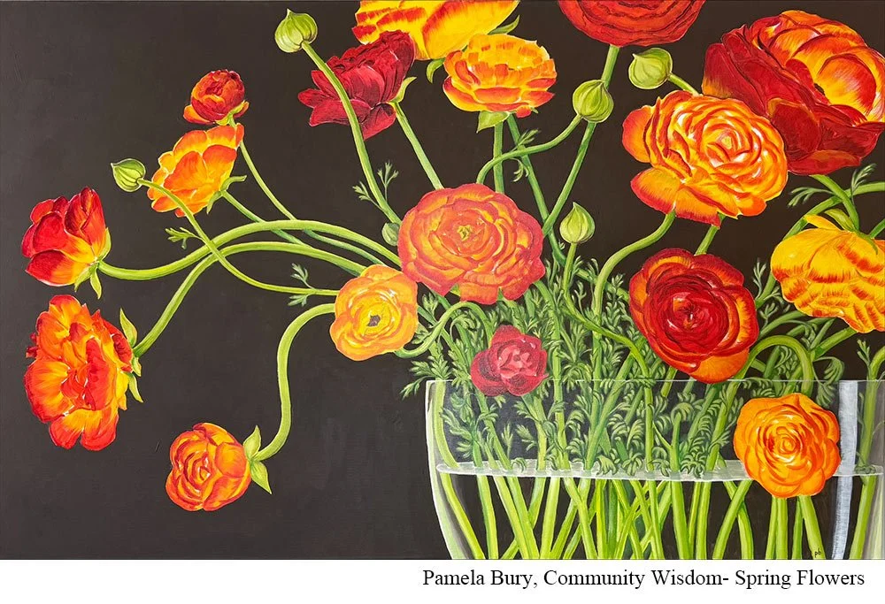
Painting: "Weight of Color"
Medium: - acrylic, 30 x 48"
Instagram: @pamela_bury
I started painting a decade ago to fill the blank spaces on our walls. I needed something large for our red dining room, and I chose ranunculus for how they tend to spill over their vase. I picked a dramatic cropping to emphasize the unique blooms stretching in all directions.
I do find painting ranunculus challenging because of the feathery leaves on the stems and the sheer amount of petals and color variations within each flower
I think painting the unopened blooms adds fun and great color, plus making the petals and leaves a bit more abstract made this more successful. I kept my background very flat and one-dimensional so the focus is only on the flowers and the vase.
Patti Vincent- Iris
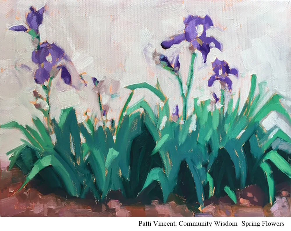
Painting: “Studio Iris”
Medium: Oil on canvas
Instagram: @PattiVincentStudio
I love painting Iris because of their bold color, cool blue green leaves, and interesting negative shapes. I find getting the right colors tricky. My advice is to paint the negative shapes to achieve the flower shapes.
Val Bassett- Pansies
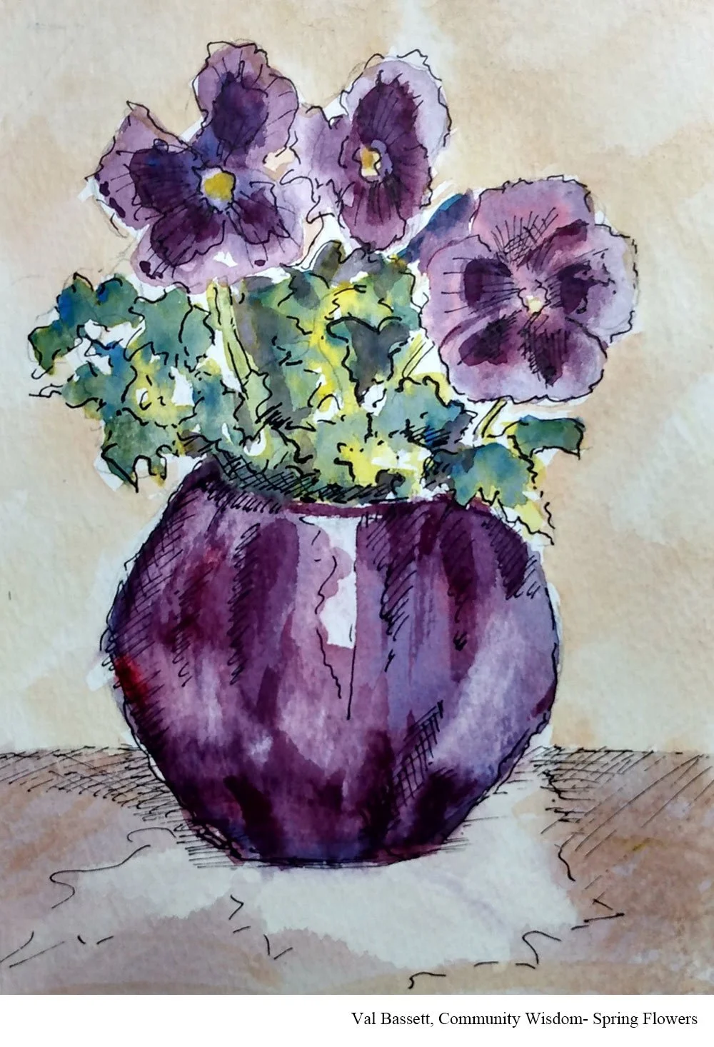
Painting: “Purple Pansies”
Medium: Watercolor and ink
Advice: paint what you like and don't think too much about doing it well. These pansies were a different purple than I was able to capture but the values work and my joy in painting them is conveyed.