
Discover The Design Power of Triangles with Chris Krupinksi
Composition can feel like a big, mysterious concept. But watercolor artist Chris Krupinski (Ep.2) has a simple starting point: the triangle.

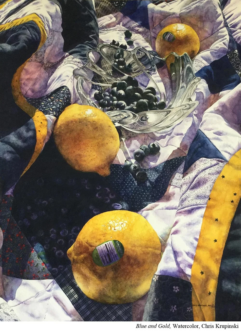
The human eye loves pattern. When you give it one thing to focus on…and then a second…it immediately starts searching for the next.
Imagine a still life with lemons. Place one lemon on a striped tablecloth and your viewer’s eye will find it. Add a second, and the eye naturally moves between the two. Add a third, and place it thoughtfully, and you’ve just created a triangle that keeps the viewer’s gaze traveling. As the eye moves between the lemons, it will also discover other details along the way, lingering in the composition longer.
This concept doesn’t just apply to lemons. Krupinski uses this triangular rhythm throughout her work. She arranges her major shapes in threes to guide the viewer’s attention into the painting and keep it moving within the frame.
She also applies the same principle to color. In her painting Another Distorted View, for example, Krupinski places yellow in a triangular pattern. The repetition and placement unify the piece and create visual energy.
Put it to Practice:
In your next painting, look for opportunities to use triangles to strengthen your design.
You don’t have to follow your reference exactly. Try changing or removing elements to create a triangle of color or shape, such as replacing a yellow flower with a red one to form a triangle of reds.
Test your ideas with a few quick thumbnail sketches. They’re a low-stakes way to experiment with composition before you commit to paint.